Mizrahi Tefahot
STRENGTHENS THE VALUES OF SERVICE AND JOY
Brand Identity


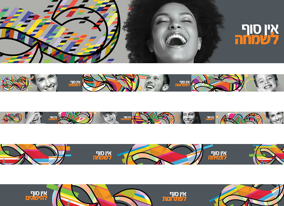
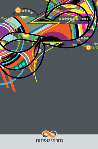
At Mizrahi-Tefahot, we keep our iconic infinity symbol – a mark of endless connection – and give it a fresh, new interpretation in a colorful, lively Pop Art style.
For the first time, the symbol is reimagined as a collection of unique artworks, adding an experiential and emotional layer that enhances the sense of joy for our customers.
A Language that Crosses Boundaries
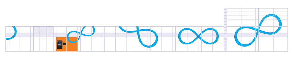
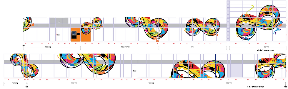
The new brand language extends beyond the branches into the public sphere, blending art into the banking world.
Each branch becomes a space that breathes contemporary art while offering some of the best banking services.


Colors and Experience
The bank’s signature colors – orange and gray – gain a creative reinterpretation, becoming the foundation of a cheerful identity enriched by vibrant compositions full of energy.
Inside the branches, this visual language merges with black-and-white photographs of smiling, happy people, combined with bold graphic expressions that create an inspiring and unforgettable experience.
Bridging Tradition and Innovation
In this way, we succeed in connecting the brand to its values – bridging tradition with innovation, and service with art.
Mizrahi-Tefahot becomes a vibrant and colorful space where customers don’t just receive service – they also experience a moment of inspiration and joy.