Renanim Mall
WHAT'S
UP
TODAY
Brand Identity


WHAT'S UP TODAY?
Strategy, branding and real-time experience
The challenge
Renanim Mall is entering a period of change.
Not a cosmetic change, nor a media “refreshment,” but a profound change in the way such a place is perceived, experienced, and felt.
The main challenge was not to redefine diversity,
But to redefine the experience.
In a world where malls, brands, and messages look more similar than ever,
The question wasn't what was here, but why come now.


The strategic starting point
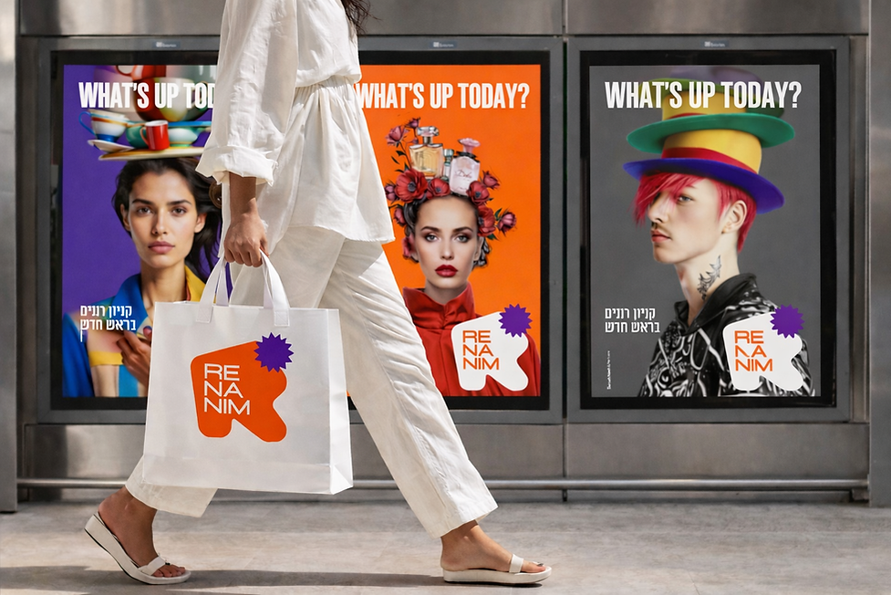
WHAT'S UP TODAY?
At Baruch Naeh & Partners, the strategy did not begin with classic audience definitions or with formulating one big message.
She started with a daily, almost intuitive wish:
What's happening today?
WHAT'S UP TODAY?
Not as a slogan, but as a state of mind.
This question became the anchor from which the entire movement was built.
Strategic, experiential and design.


Changing perception
From a shopping mall to a state of consciousness
The central understanding was that Renanim Mall should not be “a place you come to when you need to,” but a place you enter because something intrigues you at that moment.
Not a planned goal, but a spontaneous decision.
Not a uniform experience, but a sequence of moments.


The anchors of the strategy
Surprise | Dynamism | Desirability
The strategy was based on three clear anchors:
Surprise
Not big, pre-planned events, but small, unexpected moments, the kind that meet you along the way.
Dynamism
An experience that is constantly changing, not what happens once a month, but what happens today.
Desirability
Not through promises, but through a feeling. A desire to return even without a specific reason.
It quickly became clear that leadership was not functional, but emotional.

Multiverse Mall
Multiple worlds, one experience
From this thinking, the idea of Multiverse Mall was born.
Not as an inflated concept, but as a way to enable multiple worlds at the same time:
fashion
food
children
lifestyle
night
Worlds that live side by side, without hierarchy and without choosing just one.
Every visitor finds their own world and sometimes discovers another world along the way.


Translating strategy into design
A language that feels before it explains
The strategy was translated into a design language that forgoes direct explanation,
And choose a sensory experience.
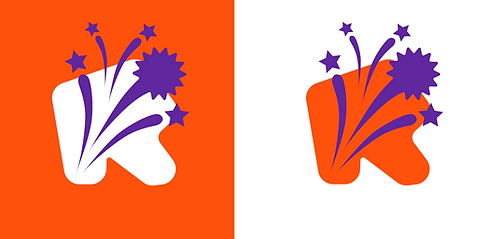
The logo and icon
The logo was built as a free typographic form,
Which contains the name Renanim broken down into syllables
RE / NA / NIM.
It is not a “closed symbol,” but a living, changing form, one that looks like something you came across by chance and is worth stopping for.
The purple star accompanying the symbol serves as an asterisk:
A surprise, a sale, a special moment, and a reminder that every day something different awaits.


Colorfulness and materiality
Mood, not graphic code
Orange was chosen as the leading color because of the energy, movement, and joy it generates. A color that feels happening.
The purple integrates in a moment of disruption and emphasis, a surprise within the sequence,
A moment that stops the eye.
The materiality of wrinkles, wrappings, packaging reinforces the idea of the moment:
Something that appears, is experienced, and disappears.


The language of communication
Happening now
Advertising language does not tell a linear story.
It does not promise a future; it emphasizes the present.
Pop-ups.
Clues.
COMING SOON.
WHAT'S UP TODAY?
The experience is built through a feeling of “good that I came in.”

A strategy that lives in space
Renanim's move represents a concept according to which strategy, branding, and design
They are not separate stages but one living system.
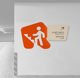
The strategy didn't stay in the document. It went down to the floor, to the signage, to the experience, and to the daily interaction with visitors.
And in the end, it all comes down to one simple question:
WHAT'S UP TODAY?
Every day.
Every corner.
Every visit.