Tnuva
DESIGNING THE MOST ICONIC AND BELOVED DAIRY BRANDS IN ISRAEL THAT STAND OUT IN EVERY FRIDGE
Tnuva
DESIGNING THE MOST ICONIC AND BELOVED DAIRY BRANDS IN ISRAEL THAT STAND OUT IN EVERY FRIDGE
Maccabi Healthcare Servises
THE BRANDING JOURNEY OF MACCABI – A NEW ORDER IN HEALTHCARE
Brand Identity, Brand Charecter


For many years, no one touched the design of Maccabi’s brand. As the second largest and most advanced HMO in Israel, we realized it was time for a revolution.
The old brand consisted of the word “Maccabi”, a Star of David, and two arches – but in practice, this caused confusion.
Every medical domain was associated with a different logo, so that in one clinic you could find four to six different logos.
It was clear: order had to be restored to the chaos.
Accurate Strategy and Clear Brand Architecture
The first step was to define a precise brand strategy and clear brand architecture.
We mapped out the identity of the master brand – Maccabi – and defined all sub-brands operating beneath it.
We created a clear hierarchy: one master brand and supporting sub-brands, defined in a uniform and coherent way.


Developing a New Design Language: Symbol, Typeface, Colors
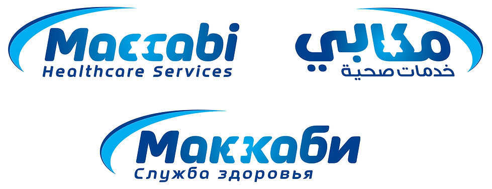
We designed a unique typeface that integrates Maccabi’s identity into the letters themselves, incorporating the Star of David not as a separate symbol but as part of the letterforms.
We chose to adhere to a unified palette of two shades of blue – dark and light – with the dark blue leading the visual language. This became the central color of the new logo.
In the final stages, after reaching a minimalist and precise logo, a request was raised to preserve a design memory from the past.
Thus, we kept part of the original arch – softened and refined – as a dynamic element recalling Maccabi’s energy and linking back to the original brand.
Consistency in Signage and Clinics
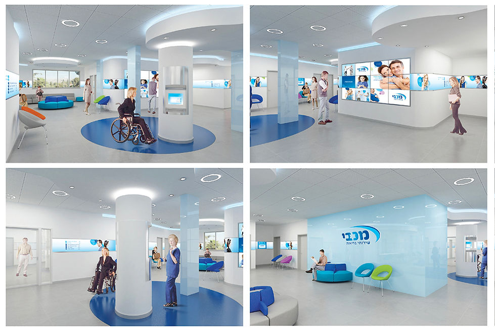
We designed a minimalist, uniform signage system spread across all Maccabi touchpoints – clinics, centers, and branches.
Until now, each nurse or administrator would add personal decorations and symbols, undermining consistency and clarity.
The new branding cleans away this noise, creating a clear and structured experience.


The Message: “Progressing for You”
We selected one simple and powerful message: “Progressing for You.”
This is not just a slogan – it is embedded in dozens of decorative posters and uniform signage that reinforce this idea at every medical interaction.
The message is present at every touchpoint – from clinic signs to doctor’s office signage.
A Comprehensive Branding Language – Advertising, Digital, and Physical
We built a clear advertising and visual language including:
A structured grid for ads
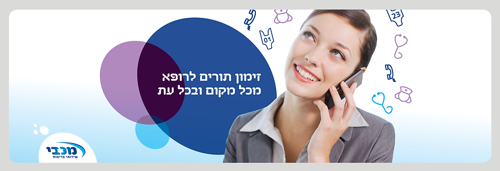
Unique, understandable pictograms
A unified design language across all medical domains, including digital interfaces
We translated the new logo and typeface into multiple languages – Hebrew, English, Arabic, and Russian – ensuring Maccabi looks and sounds consistent to all members.


Implementation Across All Dimensions
The project did not remain only on paper or screens:
Membership cards were redesigned
Every sub-brand – such as Maccabi Pharm – was redesigned under the new visual line
Unique furniture was designed with interior architects to reflect the new identity in clinics
We created new digital experiences, advertising campaigns, and dynamic communications with a strong human touch
Personal Reflection
This was a journey spanning over two years – bringing maturity, consistency, and a clear, new identity to the Maccabi brand.
Every interface – image, communication, or medical – now expresses the new Maccabi: a leading, progressive, consistent, and above all, human brand.


