Tnuva
DESIGNING THE MOST ICONIC AND BELOVED DAIRY BRANDS IN ISRAEL THAT STAND OUT IN EVERY FRIDGE
Tnuva
DESIGNING THE MOST ICONIC AND BELOVED DAIRY BRANDS IN ISRAEL THAT STAND OUT IN EVERY FRIDGE
Maccabi Pharm
A GROUNDBREAKING BRANDING INITIATIVE FOR MACCABI PHARM
Brand Identity, Brand Charecter


Vision
At Maccabi Pharm, we don’t just provide medical services. We lead a vision of professional, advanced, and personalized care.
As part of the ongoing innovation of the Maccabi Group, we launched a significant branding initiative aimed at sharpening Maccabi Pharm’s identity as an inseparable part of the Maccabi DNA – “Progressing for You.”


A New Branding Vision – Consistency, Differentiation, and Strength
After a comprehensive process of developing brand strategy and brand architecture for the entire Maccabi Group, we applied this branding language to Maccabi Pharm.
The result: a new, clear, and consistent visual identity that speaks one unified language – professional, approachable, clear, and most importantly, human.
Color Palette and Customer Experience
We carefully selected a color palette: the signature Maccabi blue combined with soft turquoise – a health-related color that conveys cleanliness, sterility, and calmness, like in an operating room.
This choice is not only distinctive and unique but also creates a clear differentiation from other pharmacy chains, led by Super-Pharm.
The custom-designed typeface accompanies Maccabi’s brand identity and integrates seamlessly into the graphic grid, maintaining high readability while conveying a modern feel.

Strengthening the Human Message
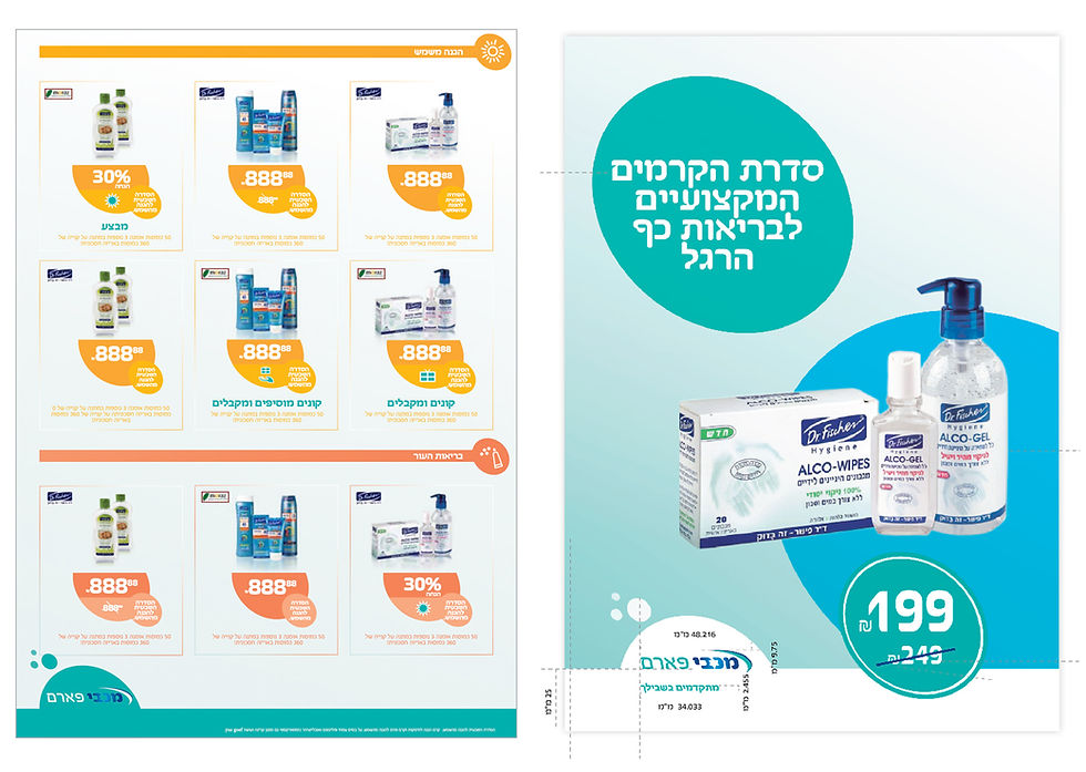
Every poster, every sign, every sticker – all are designed to reflect convenience, simplicity, and the sense of professional service in the middle of a busy day.
We place the customer at the center – not just as a slogan, but in every design detail, in the shopping experience, and in the service itself.
From store signage to magazines to interior design, the materials express the combination of human content with functional, precise, and up-to-date design.
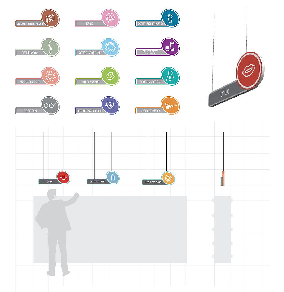
The iconography we developed creates an intuitive navigation experience for customers, while also conveying trust, confidence, and accessibility.

Store Design – A New Retail Experience
The architectural and interior design of Maccabi Pharm branches was adapted to the new branding language, with clear categorization by departments, inviting waiting areas, a smart and differentiated signage system, and a service-oriented approach that emphasizes our advantage as a pharmacy integrated within a comprehensive healthcare group.
Our emphasis is on combining professionalism with warmth – and the new design embodies exactly that.
Conclusion
The branding initiative of Maccabi Pharm is not just a graphic refresh – it’s a declaration.
A declaration about how we see our customers, about our responsibility as leaders in the healthcare sector, and about our ambition to provide not just service, but a complete health experience.